How to choose the perfect colour palette for your brand ??
A couple of weeks ago, I dug out my trainers and gave City2Surf a red hot crack!
I’m not a runner by any means so I found I was relying on the adrenaline and surroundings to keep me on track and distract me from counting down the minutes left to run.
Even though I was pretty intently looking around me so as not to focus on the run, I couldn’t tell you what I shops or cafes I passed (even though there were heaps).
That is, except for one beautiful little cafe on the home stretch near Bondi. As I was approaching, I couldn’t help being drawn to it and to make a mental note to come back another day to check it out.
The whole building was painted in a solid peachy tone with a contrast pink strip towards the bottom. It looked so quirky and beautiful that I nearly stopped then and there for a quick Cappucino! It’s funny how much we all resonate to colours and they make us feel a certain way.
I can almost instantly be turned on or off a brand based on colours alone. So it’s a pretty big decision when you go to pick the colour palette for your brand.
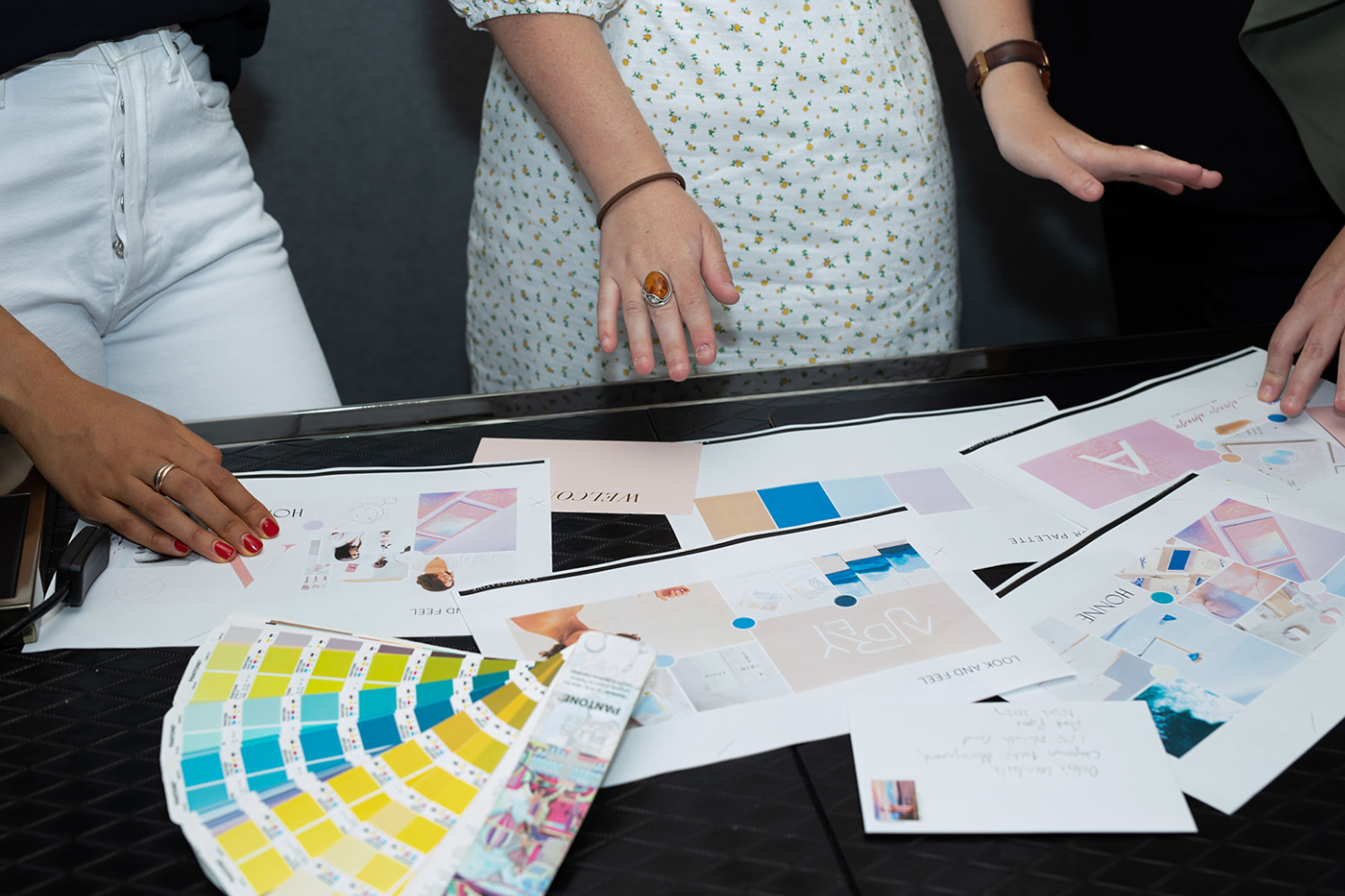
With just a couple of shades, you want to communicate to people what your brand is about and let them know if it is for them. So I get it can be daunting!
That’s why in todays’ video I’m giving you my top tips to help pick the perfect palette. There are some awesome tools included in todays’ video that will have you choosing the perfect hues to represent you.


